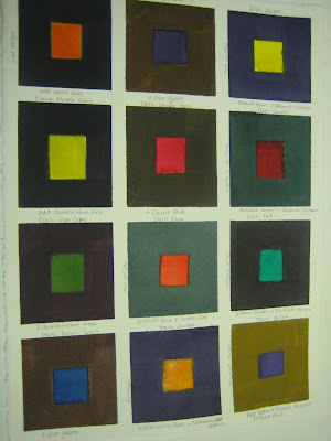
Sparkly Darks
We did another color color chart this week. This one was all about making grays that were also colors, so we could have lovely shadows in our paintings that aren't black, or really neutral grays. I love color charts.


I know it's hard to see (it's really, really hard to take good pictures in our new cave of an apartment), but hopefully you get the idea. So to apply this, our next piece is supposed to have darks in it. I have chosen the picture below as my photo reference. It's another one I took in France, which would explain why, you know, the writing on the monument is in French. I know you can't see it all because the statue's head is blocking your view, but it says "A nos morts glorieux," which translates to "To our glorious dead", more or less. There are little monuments like this in most of the towns and cities in France, as memorials to the men who fought and died in the World Wars. I think they are beautiful and touching. A solemn and beautiful reminder of the price Europe paid for the wars. A price well paid.

Here is my drawing I did, adjusting the words so the word "glorieux" could at least be partially seen above her head.

It's a pretty horrific drawing, but it will do for now. I'll be posting the value study and partially finished painting tomorrow (hopefully), as well as the finished window painting that I said I would post. Yay!


Comments
Post a Comment